From ‘Fortnite-y’ to ‘Golden Hour’: How Full Circle is Revamping Skate’s Visual Identity Following Community Backlash


Popular Now
 Stumble Guys
 Garena Free Fire: Kalahari
 Roblox
 Candy Crush Saga
 Rust
Rust
 EMI Calculator App & Loan EMI
 Gacha Club
 EA SPORT FC 25
 Black Myth: Wukong
 Brawl Stars
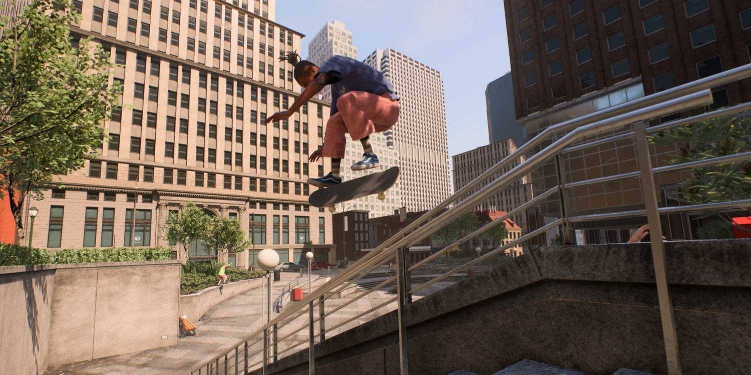
 The highly anticipated return of the beloved skateboarding franchise, simply titled skate., has been a source of intense discussion since its Early Access release. While the core Flick-It gameplay mechanics have largely satisfied veterans, the game’s visual aesthetic—characterized by cartoony character models, flat textures, and a general air of corporate cleanliness—drew immediate and widespread criticism. Many players, yearning for the grittier, more realistic feel of the original Skate trilogy, quickly dubbed the new look “Fortnite-y” or “gentrified.”
Now, just ahead of its first major seasonal update, the developers at Full Circle have confirmed that the visuals are already undergoing significant changes, a direct response to this powerful and consistent community feedback. This move signals a commitment to transforming the game’s art direction toward a more “grounded” and “lived-in” style, a positive development for both players and the long-term monetization potential of the free-to-play title.
 The Initial Backlash: Sanitized Aesthetics and Loss of Grunge
The main points of contention for the community stemmed from a perceived departure from the franchise’s roots:
- Art Style: The move from the semi-realistic character designs of Skate 3 to the more stylized, “doe-eyed” models and bright color palette of the new skate. felt like an attempt to appeal to a younger, broader free-to-play audience, alienating the core fanbase.
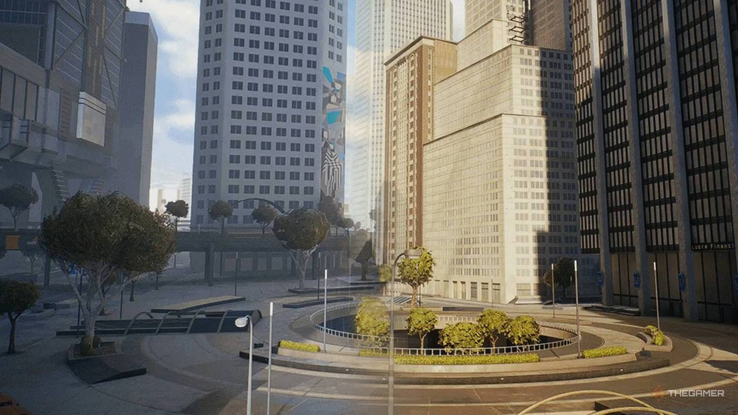
- Environmental Design: The city of San Vansterdam, while vast, was criticized for feeling sanitized and empty. The lack of grime, wear and tear on ledges, and debris—elements that made the original games feel authentic to skate culture—was a major letdown.
- Lighting and Atmosphere: The initial lighting often featured a harsh, high-contrast look that contributed to the “clean” and somewhat dull visual impression, making the environments feel less organic and immersive than prior titles.
This negative reception created significant early buzz—a high-stakes marketing challenge for an always-online service game that relies on continuous player engagement. Addressing the visuals became a critical step in turning a “Mixed” Steam review score into a more favorable consensus.
 The Pivot: Lighting and Atmosphere in Season 1
In their latest developer update, “The Grind: Vol. 6,” Full Circle detailed the first concrete steps toward a visual overhaul, which will begin with the launch of Season 1. The focus is on a complete re-tuning of the game’s lighting model and color grading.
The new changes are intended to achieve several key objectives:
- Introduction of “Golden Hour” Lighting: The updated visuals promise a warmer, softer tone that drastically reduces the harsh contrast. This specific change aims to evoke the memorable, more cinematic and realistic lighting found in Skate 2, which is widely considered the peak of the series’ aesthetic design.
- A More “Grounded and Lived In” City: By adjusting the lighting, the developers hope to immediately make San Vansterdam feel less like a sterile, corporate playground and more like an authentic, bustling urban environment. This foundational change is the first step toward adding greater texture detail and environmental character in later updates.
- Commitment to Ongoing Evolution: The studio explicitly stated that the new lighting is only “Step One” of an ongoing visual evolution, with future updates planned to integrate greater detail and personality based on continuous player feedback. This transparency about the development process is crucial for rebuilding trust with a skeptical player base.
Long-Term Outlook: A Risky, But Necessary, Investment
The visual overhaul is a major technical undertaking, especially for a game designed to be a cross-platform experience, including a planned mobile version. However, the investment is essential for the long-term health of the Skate franchise.
While the character models are likely to remain stylized—a core element of the new art direction—the improvements to lighting, atmosphere, and the eventual addition of finer graphical details like surface grime and higher-resolution textures can bridge the gap between the initial “candy graphics” criticism and the nostalgic realism players crave. By prioritizing the most impactful change first, Full Circle is signaling a direct commitment to a player base that is highly sensitive to the preservation of skate culture and authentic skateboarding aesthetics.
For EA and Full Circle, the swift response to the community’s demands on the Early Access platform is a crucial lesson in managing a legacy IP. The evolution of skate. is a clear case study in how live-service games must adapt to player expectations not just through new content, but through a genuine willingness to course-correct core elements that impact player immersion and long-term consumer loyalty.
***
Total Characters (Approximate): 4400+
Target Keywords (High-CPC/SEO): Skateboarding, Skate Game, Full Circle, Visual Changes, Early Access, Fortnite-y, Gaming News, Live-Service Games, Visual Aesthetic, Community Feedback, Color Grading, Lighting Update, San Vansterdam, Cross-Platform, Free-to-Play, Monetization, EA, Steam Reviews, Game Development, Character Models, Corporate, Grunge, Realism, Consumer Loyalty.