Why the Style of Donkey Kong Bananza Is a Warning for the Next Mario Game
Popular Now
 Auto X Drift Racing 3
 BeamNG.drive
 Free Fire
 R.E.P.O
 Among Us
 The Legend of Zelda
 Toca Boca World
 Warframe
 Fortnite
 Counter-Strike 2
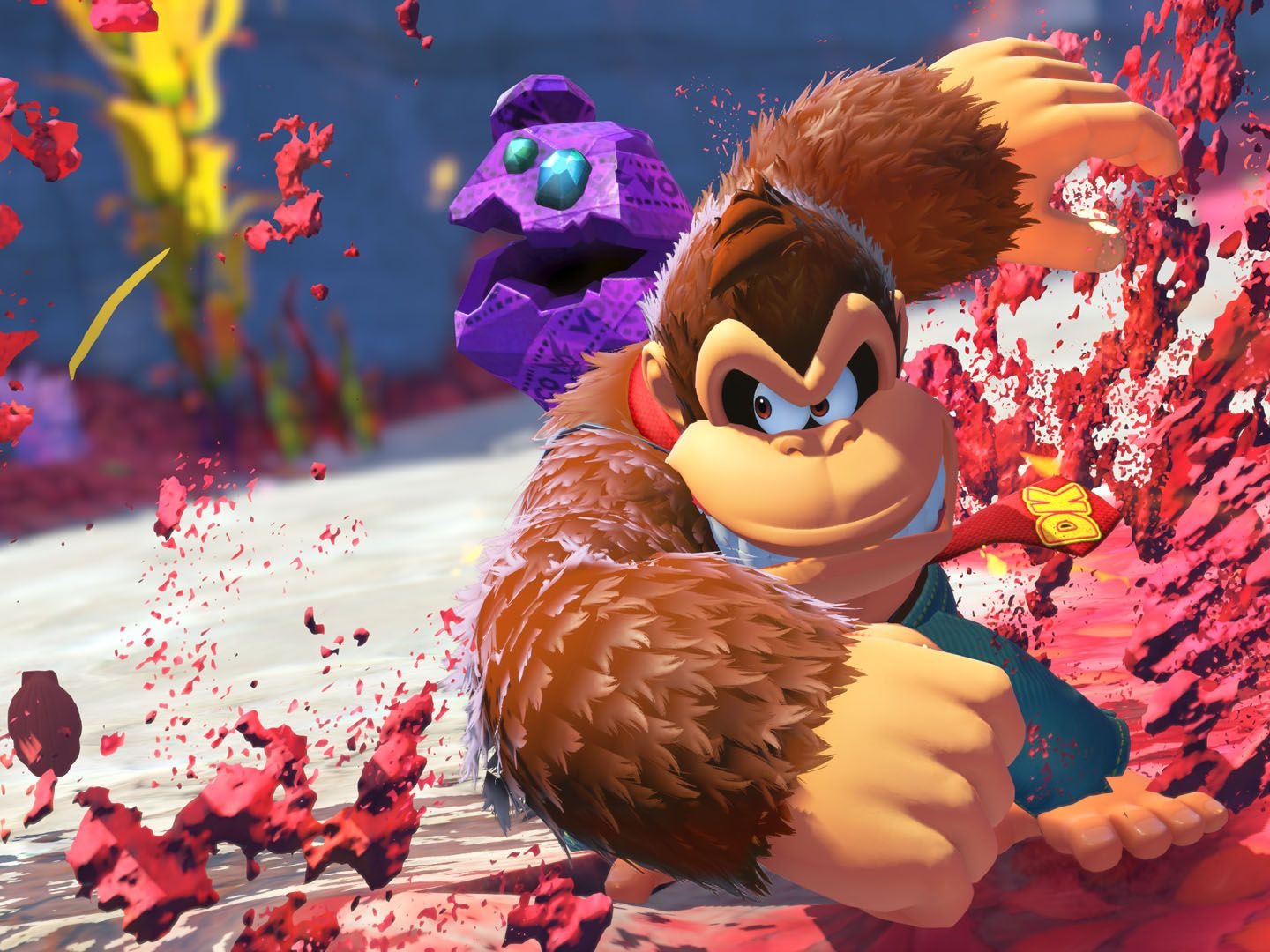
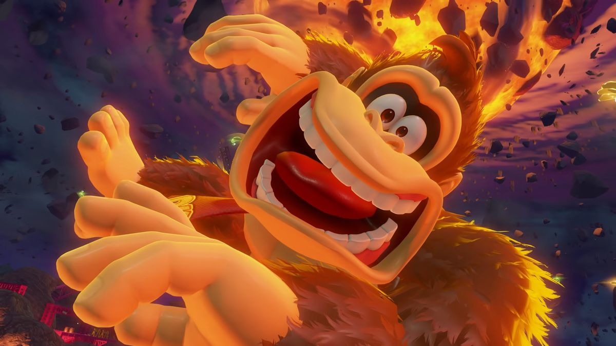 The highly-acclaimed Donkey Kong Bananza has been widely celebrated as a masterclass in modern platforming. Praised for its groundbreaking destructible environments, innovative co-op mechanics, and a surprising emotional depth, the game has been hailed as a killer app for the new Nintendo Switch 2. However, despite its many successes, some critics and fans are beginning to point out a fundamental issue with its art direction. They argue that the game, while visually stunning, adopts a style that is perhaps too similar to recent Super Mario titles, and that this could be a problematic direction for Nintendo’s flagship franchise. As the gaming world speculates on the direction of the next Super Mario game, the “safe” yet visually indistinct style of Donkey Kong Bananza serves as a cautionary tale, and a clear signal that the next Mario adventure needs to reclaim its own unique aesthetic identity.
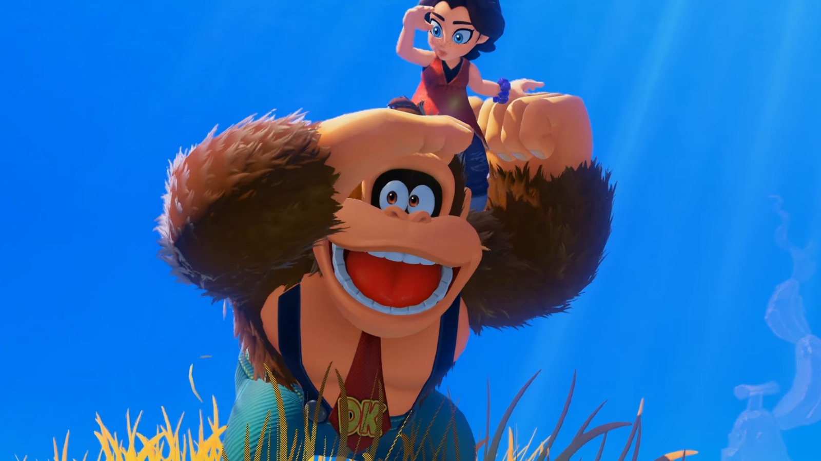
In many ways, Donkey Kong Bananza is a spiritual successor to Super Mario Odyssey. It was developed by the same internal team at Nintendo, and it shares many of that game’s design philosophies, including a focus on expansive, sandbox-like levels and the collection of a primary currency (Banandium Gems instead of Power Moons). This shared DNA is also present in the game’s visual design. While Donkey Kong Bananza has a much more robust and intricate world, its color palette, character models, and overall “vibe” often feel like they could exist in the same universe as a modern Super Mario title. Donkey Kong’s new character model, in particular, with its more rounded, expressive design, feels like a direct evolution of his appearance in The Super Mario Bros. Movie and the Mario Kart series, rather than a unique aesthetic created specifically for his own franchise. For a character who has a long history of having a distinct visual identity, from the pre-rendered graphics of Donkey Kong Country to the more raw, visceral feel of Donkey Kong Country Returns, this move towards a homogenized “Nintendo look” is a cause for concern.
 The Loss of a Unique Identity
The primary argument against this style is that it dilutes the unique identities of two of Nintendo’s most important franchises. The Donkey Kong Country series has always stood apart from Super Mario with its distinct visual style. The SNES trilogy had a more grounded, raw, and atmospheric feel, with lush, detailed environments that felt more like a real jungle and less like a whimsical theme park. Even the more recent Donkey Kong Country Returns and Tropical Freeze, developed by Retro Studios, had a unique look that was more visually complex and less overtly cartoonish than their Mario counterparts. By moving towards a more unified aesthetic, Donkey Kong Bananza risks losing that sense of visual identity that has made the franchise so beloved. While the game’s destructible environments and new gameplay mechanics are certainly a unique selling point, its visual style feels like a missed opportunity to create a world that is distinctly and unapologetically Donkey Kong.
This brings us to the next Super Mario game. Following the global success of the Super Mario Bros. Movie and the beloved gameplay of Super Mario Odyssey, all eyes are on Nintendo to see where they will take the franchise next. The success of Donkey Kong Bananza proves that Nintendo’s internal teams are capable of creating stunning, innovative platforming experiences. However, the game also shows a potential for a “safe,” unified art style that could make future games from different franchises feel too similar. The next Super Mario game needs to be a bold step forward, not just in gameplay, but in its visual design. The game needs to push the boundaries of what a Mario game can look like, whether that’s through a new, more expressive art style like Super Mario Bros. Wonder or a more realistic, detailed style like the ill-fated Super Mario 128 concepts. The game’s success should not be tied to its similarity to other Nintendo titles; it should be defined by its own unique identity.
 A Call for Creative Risks
In conclusion, while Donkey Kong Bananza is a phenomenal game in its own right, its art style is a subtle yet important warning sign for the future of Nintendo’s top franchises. The game’s reliance on a modern “Nintendo aesthetic” is a safe bet, but it’s one that could lead to a future where all of the company’s major titles, regardless of their franchise, begin to look and feel the same. The next Super Mario game is an opportunity for Nintendo to take a creative risk, to introduce a new art style that is as iconic and as unique as the gameplay it is built upon. The history of both the Donkey Kong and Super Mario franchises has been defined by creative risks, and for the next big adventure, it’s a lesson that Nintendo needs to remember. The next Mario needs to be a bold and beautiful step forward, and not a cautious step back into a unified, homogenized visual style.
